
My Job Tank
Website Refresh and UX Design
I was hired to refresh the then My Job Tank website, re-design the information architecture and the UX /UI design. I also re-defined the branding and market proposition and improved the SEO. Below are some snapshots of how I tackled this project.
My Job Tank is an international company providing Technology-Driven staffing solutions globally.
The Business Pains
✤ When I took on this project, the company is in the transition of developing new service offerings, so they needed some help to integrate them not only to the website but also with the company’s mission and the brand seamlessly.
✤ The website was also built on HTML and therefore lacked the flexibility to expand and handle updates regularly.
The Users Pains
✤ From the users’ point of view, it also needed UX improvement! During the initial UX interview process, the feedbacks I heard most often was the users of the website didn’t quite understand what My Job Tank was offering and were unsure how they can help.
During my design review, I realized that one of the users’ pains was the less-organized information architecture, which caused the users to have a hard time accessing the information that they actually needed. For example, the context and the service offerings for the clients were mixed together on one page.
✤ The users were also experiencing some bugs that interrupted their user experience or even stopped them from accessing the information they needed.
Refresh the Information Architecture, UX/UI, Branding, and design a new service program.
Often, A good user experience takes much more than just being aesthetically pleasant.
During the UX research phase, I had a chance to learn about the feedbacks about the company website from the company stakeholders, the recruiters, the clients, and the job seekers at that time.
The feedback of the confusions of their experiences helped me realize the website needed a major information architecture transformation.
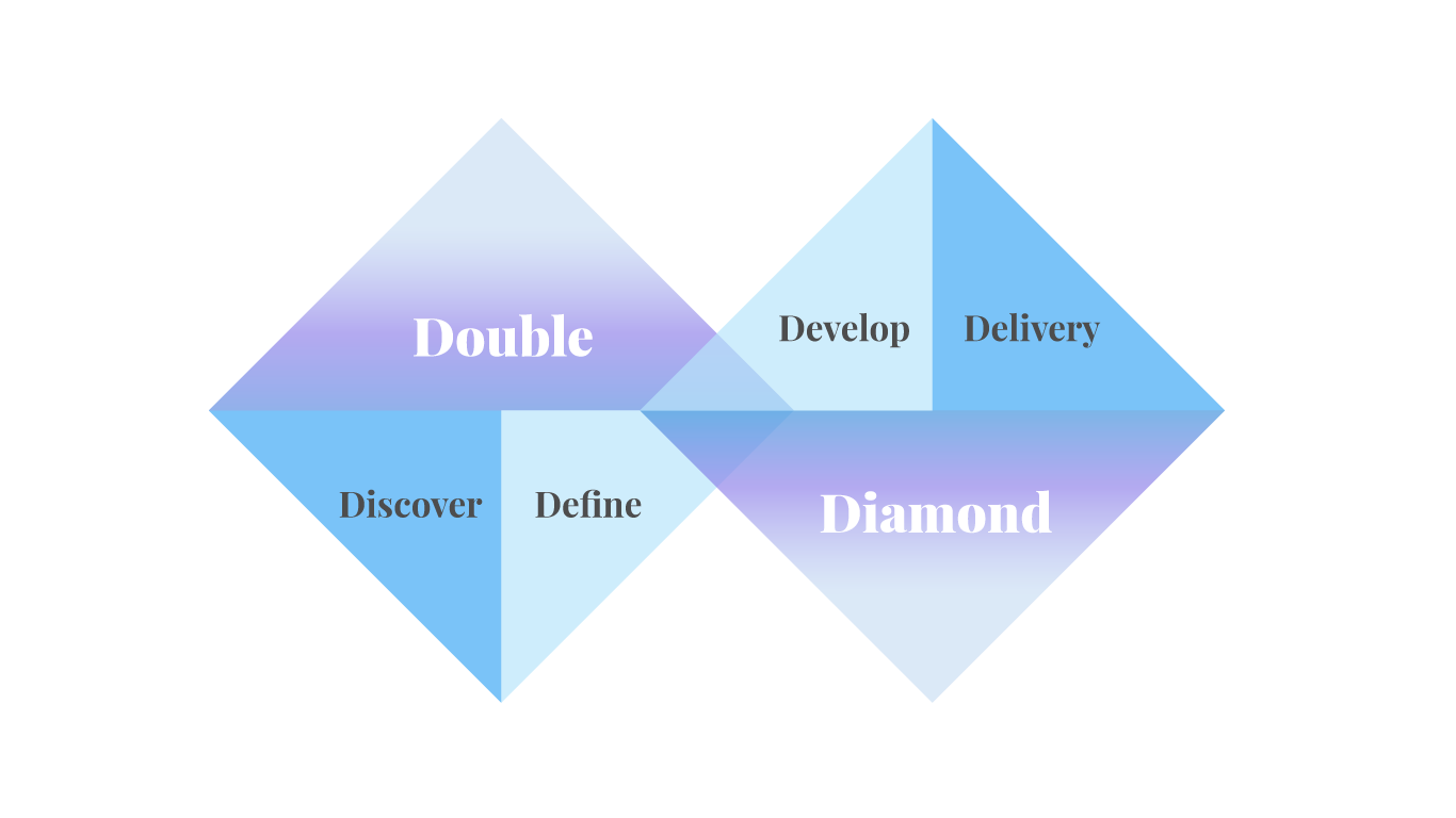
For a challenging project with a short delivery timeline, I took the Double Diamond design process and had started my research on the competitive advantages for the company, by analyzing the industry-leading recruiting firms on different scales and industries, and the set an approach that would work best for My Job Tank.
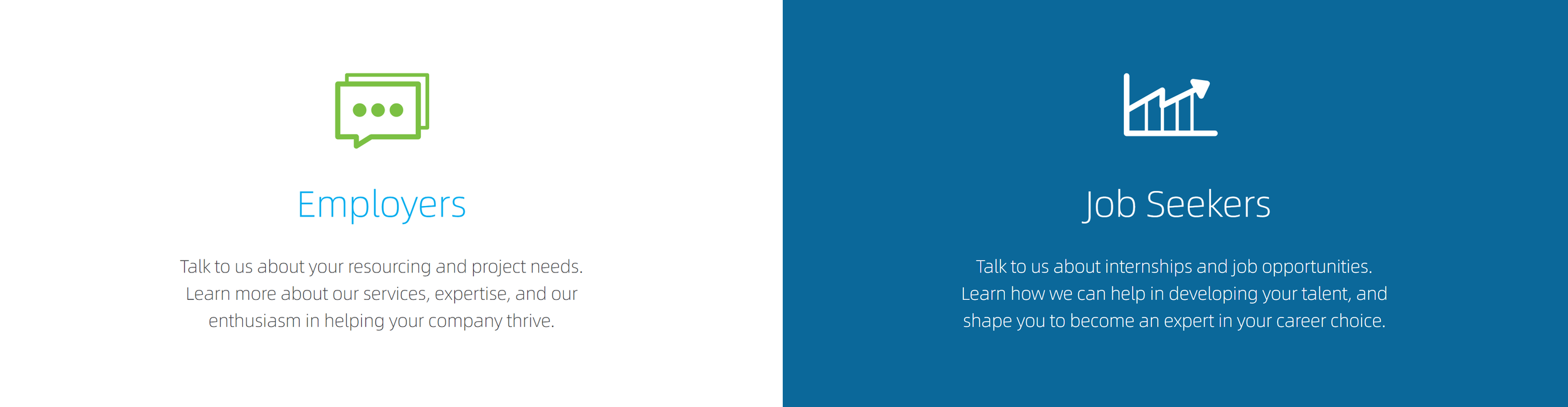
Understanding who the users are for My Job Tank, I had designed an information architecture and a brand narrative that can serve all groups, their corporate clients, the newly graduated, the experienced job seekers, through clear layout design and messaging.
By setting up different sessions, summaries, and action steps for each group of users on the home page, now the users are able to identify and access the information they need right away from the start.
To help the clients to identify the talents they need, instead of choosing to continue listing out all the current positions on their website just like everyone else while the company was in the process of launching its new service offerings, I adapted the head hunters approach and positioned the narrative for the candidates to come to them, and let the company’s recruiters team start the communications in a meaningful way, and carefully hand-picked the best match for their clients based on the candidates’ experiences and skillsets.
On the other hand, we wanted to take well care of another group of users, the job seekers too! Understanding new service offerings were still in development during that time, and that part of their service was to help the newly graduated to gain the skills and experiences they need to enter the highly competitive job market. I took an initiative and designed the branding for the Career Forward program.
After the redesign of the information architecture, not only that it now gives the users a much better user experience, the site is now equipped with effective SEO tools and fully implemented in a secure CMS with abundant capabilities like form submission, resumes upload, etc. The room for future scalability is endless!
Understand the color, visual and human psychology

To help the company build its visual present when it was going through growth with services development in flux, For this project, I had chosen UX design methods that I was backed by psychology and focused on striking positive emotional responses. For example, using the skies and the sky-blue color as visual elements to give the users a sense of calm, openness, optimistic and limitless - just like the old saying, “ The sky is the limit.”
Those design decisions have helped to deliver the company’s mission, values, culture, and how they can help in an efficient way and are able to build trust with their clients and help the job seekers too!
Define the art and imagery direction
By unifying the brand, providing a curated narrative, an aesthetic, and a photography theme that aligned with the My Job Tank’s brand, we were able to initiate positive emotional responses and the user experience.

Lead with images and the narrative
I created a narrative for the website design and had made them short and engaging. When paired with the right images and visual components, the way of how the messages come across has become much more powerful!
This approach was critical and better suited for My Job Tank while they were in the middle of a transition with some service offerings.
While this works well during this transition, I also left room for scalability and had designed the layouts, and the deeper layers of information architecture for the service offerings, so that company can use them in the future.
The new company site was able to generate new leads and interests with consistent acquisitions and applications days after the relaunched while giving My Job Tank time to continue to expand its services.
After the transition phase, My Job Tank has continually adapted the artistry, the UX and information architecture design, and the brand messages I created today.