Publications
Infosheet, Booklet & Annual Reports

Here you can find some publications that I did over the years.

Global Warming

This project is to inspire viewers about Global Warming. I have chosen to use color palettes that correspondence with the natural elements in our planet — For example, Orange is associated with the impression of heat and warmth; Green and Blue are the colors of our forests and our sky, which give the viewers a sense of how the future of our planet could be. The image selections are the reflection of the scenario’s contrast of the global warming continues, versus the future if we take action now.
Reference: Global Warming, Natural Resources Defense Council http://www.nrdc.org/globalwarming/


Epic Foundation
Corporate Social Responsibilities Fact Sheet

Epic Foundation is a non-profit that bridges the gap between a new generation of individual and corporate donors and organizations supporting children and youth globally. The objective of this project is to re-design their Corporate Social Responsibilities fact sheet and to generate discussion with the prospect corporate and sponsors.

Front Side
It introduces the organization 's mission and their CSR Strategy on how they can help.

Back Side
It talks about the organization's selection process and the number of succeed portfolios they had built for their partner.

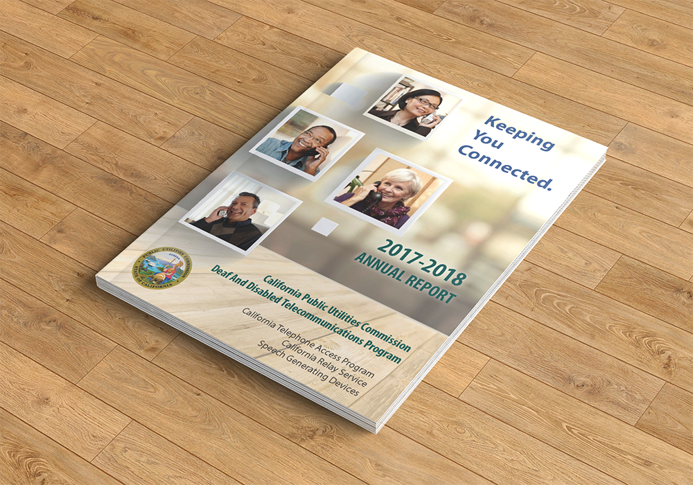
The CPUC of California
DDTP Annual Reports
I designed the annual reports for the Deaf and Disabled Telecommunications Program (DDTP) - A program of the California State, California Public Utilities Commission (CPUC). The DDTP Annual Reports is created firmly follow the program’s design system and yet to provide a fresh look than the past designs.
The design direction is based on the program population demographic from the market research of the program.