

Community Portal
A digital transformation, and an online resource community project for a non-profit organization.

What delights you in your life? While we all have things and people that we value and give us joy, it is vital to feeling satisfaction in our professional life as it is also an inseparable part of our reality. I also believe that the key to this satisfaction is to be aware of our strengths and what we genuinely enjoy doing.
For me, that lies in creating, building things, and solving problems.
With this project, I was able to flex my muscles in those areas and helped a nonprofit organization to adapt to the rapid change and continue its mission in servicing the disabled community in the age of digital transformation.
This is my story of building a product that can help the disabled community engage, access knowledge and resources in one place.

It started with an identified service gap in the disabled community. However, at that time, it was just an idea backed by a brief business case. It was taking off from there and has grown into a ready-to-launch platform. Throughout the project, I had led the project development with the project internal and external teams, and I worked through the challenging situations while implementing a web platform, and built my skills in UX design and research, user survey, prototyping, user useability test, and front‑end development.
So far it has:
Passed three rounds of user testing
Approved by the board and become an official program to go live.

Here is how the team and I had come together to overcome the obstacles and what we had learned along the way.

We had a blur idea
with great vision
Obstacle 1
◐ While a brief business case was developed for this project, most parts were still in the dark.
◐ The What and How were completely missing from the puzzle. At that time, the business case only suggested adapting an existing accessible device database (under the permitted license from the database website owner) and pairing it with some disability services directory.
◐ From my consulting experience, I recognized that in order to make this a successful digital transformation step for the organization, it would require much more to turn this into a viable, marketable product that can attract users and be impactful in the long run.
◑ First, we have to understand our role, services, and the needs of the disabled community.
To get better clarity on ensuring the product can reach its potential, I dived into a series of research on available disability resources and services in the United States and California State and identified the disabled needs through multichannel resources including user interviews and paid demographic data from the past.
◑ Second, what makes a good product?
To found out, I had buried myself into the market and competitive advantages research, academic UX design courses, analysis, the UX trend, and other components that will be critical for the product success, such as:
✣ Assessed a list of leading disability focus websites, identified their strength and weakness.
✣ Researched implementation and framework options for both open source and subscriptions platforms.
◑ Third, what do the users like?
To make sure we are building a conducive platform that can have a long-lasting impact on the disability community, I went on a hunt on disability-related resources, news, and service directory database, and also ensured that they are reliable and sustainable sources.
Based on the research and evaluation, I had created an assessment report that addressed we will need to expand the initial database-only idea to pair with other engaging components like articles, events, and forum sections that allow community contributions.
The report was reviewed and approved by the executive team, and from there, I developed the Request For Proposal (RFP) and identified project and technical scopes. Later, started my long-term collaboration with the organization- selected design partner.
In the discovery phase, we kicked off the project with a series of brainstorming sections, internal and external interviews. Through the collaborations with our design partner, we had defined the product from the user personas and user cases that were developed from the interviews with the stakeholders.

Information architecture & Framework Design
Obstacle 2:
◐ Only a high-level technical brief was developed at that time. Thus, we had to deal with lots of uncertainty and worked hard on both strategic planning and tactical solutions along the way.
◑ Identified, designed the framework and features of the product through extensive research on the availability CMS frameworks on the market. For example, Wordpress, Drupal, and their API compatibility with marketing and CRM tools such as Salesforce, MailChimp, Google Analytics.
◑ I worked with the design partner closely to develop implementation plans (on Drupal) to build out on the technical components defined in the RFP, including the accessible devices database, which will update automatically through XML mapping with the database source.
◑ I also took on the product and project management role and become the key liaison to communicate the ideas and feedback between the organization and our design partner.
Besides working on the technical solutions, I learned through this journey that active listening, transparent communications, focus on working for solutions together (especially when it comes to addressing issues) are essential elements to drive the project forward.

Technical Requirements and User-Centered Features
Obstacle 3
We then rolled into building out the detail scopes for each technical feature. I had designed the information architecture and user experience by keeping in mind that this platform is to serve people with disabilities and their loved ones, professionals and researchers.
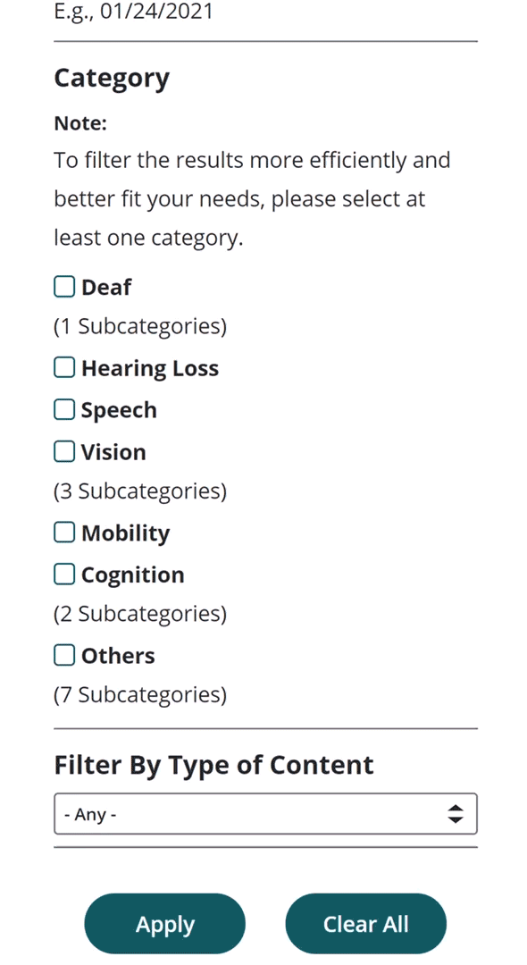
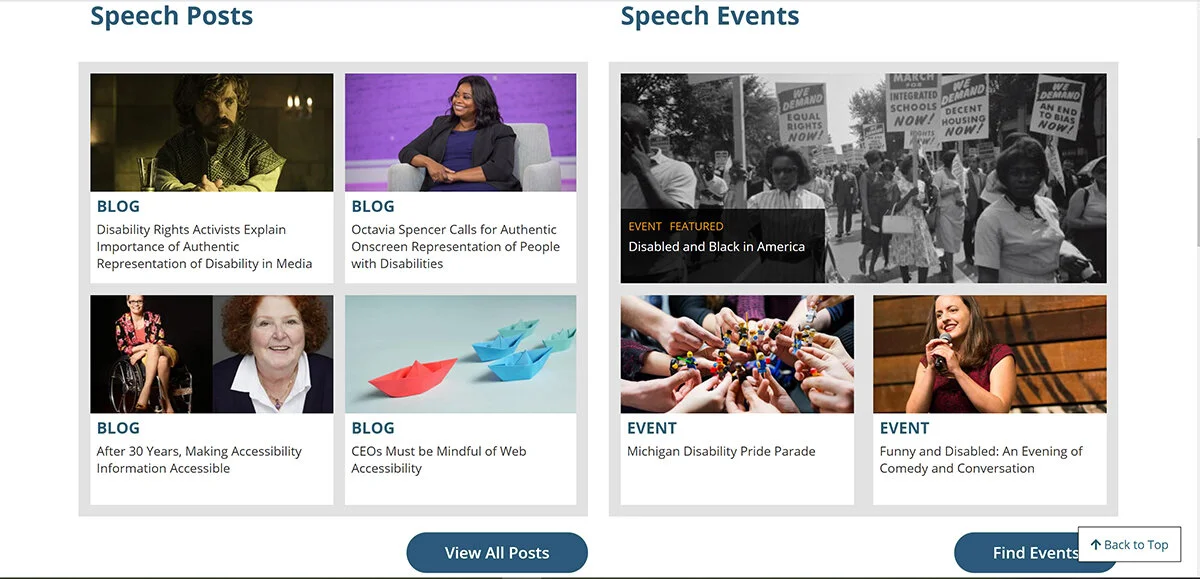
This product is to serve people with different types of disabilities so a user-friendly category infrastructure for easy content navigation is critical. I have consolidated different disabilities under seven main categories defined by industry professionals, with subcategories under each.

From the home page, the visitors can access to the landing page of a specific disability easily. Each disability landing page contains information, articles, and events under the same disability category.


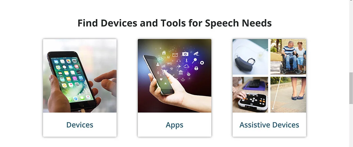
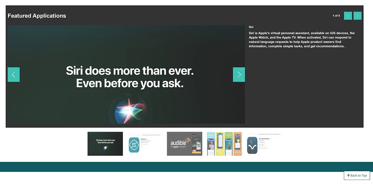
Built upon the concept of the accessible device database, we expanded the device library to include only the mobile device, but also an application library and assistive living devices.
The platform allows registered users to leave comments, rate products and services, join the forum discussion, bookmark, and share the page they like at ease.
Moreover, I took on the idea that we should of the community give users ways to engage in this online community in addition to offering devices information and service directory. As a result, we have implemented a system that allows users to participate and make ongoing contributions by adding community-oriented features.
They are the resource library, forum area, and events listing.


For an inclusive platform that focuses on disabled people and their loved ones, accessibility is the main project priority and the platform is built based on WCAG Guidelines. Some implementations are:
Overall site accessibility
by implementing the alt text field, screen-reader and audio description readiness, and more.
Color accessibility
Color and layout choice based on the right contrast level. beautiful and accessible color palettes based on WCAG Guidelines of text and background contrast ratios.

Magnify Glass
for enlarging images on the site, which is very useful for people with low vision.

Text Resize
to help visually-impaired users to adjust the text size for the most comfort for their eyesight.

The Google multiple languages tool
makes the platform accessible for non-native English speakers too.

Back to the top button
a neat tool that greatly enhances the user experience.
XML data importing
One of the project scopes is to import an open-source data set and product specifications for over 400 devices through daily XML updates. Because of the data size and complexity, it will be impossible to manage if we can’t get this right.


Batch data/ CVS file upload
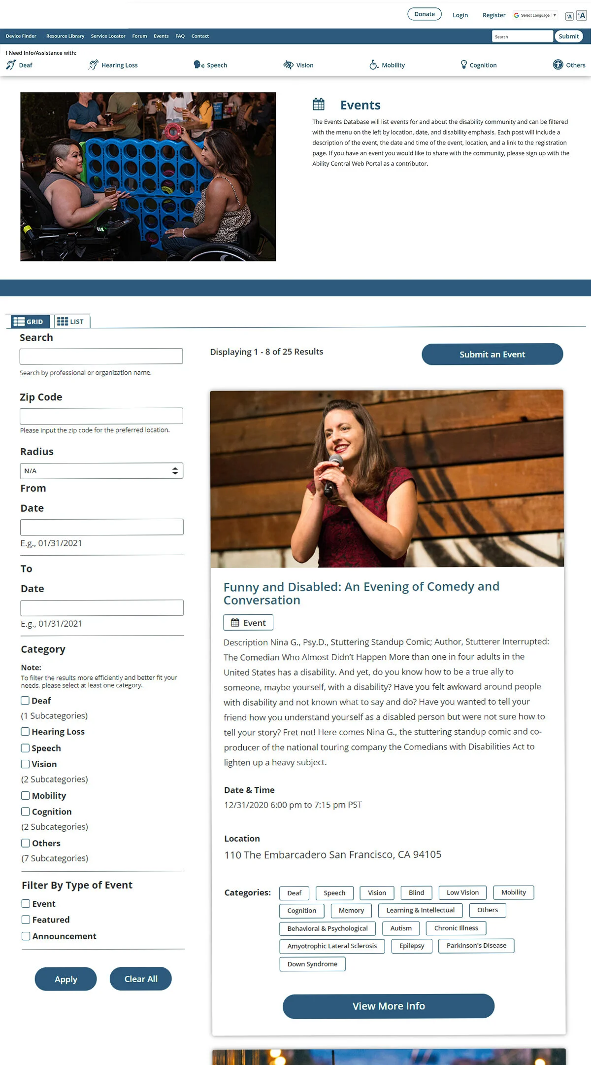
The batch upload function through CVS files is necessary as the service directory is a nationwide service listing that users can search for professional services, medical services, organizations based on their geolocation.
As a platform with a large database, we have to ensure that the users can access the information they are looking for easily:
We have the search box accessible from the navigation bar on the top, and also at the end of the page.
On the Service Directory and Events pages, we also implemented a Geolocation search.
We implemented filters for disabilities and other properties on all landing pages for devices, resources, events, and services directory.
After learning from the feedback from our first round of User Testing, we enhanced the User Experiences by linking the checked/ unchecked in between the main and sub-categories.


Because this online community allows users with different access levels (Basic User, Contributor, Trusted Contributor, Admins ) to contribute, it is critical to building a workflow process correctly.
The scopes are focus on:
✤ Users secured login for Multi-levels access.
✤ Allow users to sign up, log in, and contribute based on their access level.
✤ Define Users-role, Submission Workflow, and Sign Up Process.

UX & UI Design
How I designed the product and refined the user experiences through user testings and iterate.
I had been collaborating closely with our design partner on the product design throughout the product development.
In the early phase, I communicated design concepts from wireframes to prototypes and later redesigned the layout of key pages based on the results of our user testings.

Initially, they were all designed as static pages, which would be a colossal waste and discourage visitors to re-visit again. We want the site visitors can make their time worthwhile using our platform. With a user-first mindset, I had re-designed the home page and all the main landing pages from a static to a dashboard-style with the latest updates and featured articles accessible on one page.
Initial Design
Modified design after two round of User Testing

A customable dashboard is implemented on the homepage
I designed the user signup experience starting from the wireframe to prototype and later simplified it. After the result of two user testings, we refined the registration pages to be more compact vertically.
One of the key strategies is to give the users an option to signup for a contributor account right after registration.
The registered users now only need to answer a few questionnaires about their professional background and what interested them in joining as a contributor. To ensure safety, submissions review and approval are required.


Usability Tests and UX Strategies
After the first round of user testing, I re-designed the individual template for mobile devices, applications, assistive devices, member account and the service directory pages. This approach was based on the feedback that the pages are too lengthy, which required lots of finger motions (scrolling), and that the info display is not well-organized.
For example, in the first design for the mobile device template, all the information was displayed in a stack style inside the 50% right column, with the image section in another 50% left column. I had re-designed the one stack style column to the multi-column display and rearranged the rating and comment sections.


This re-design series has drastically reduced the templates’ length, and we had received very positive feedback on the new design in the second round of user testing.
Initially, they are all static pages. After the 1st round of user testing, while receiving the feedback was they were repetitive and not very useful. I re-designed the information architecture, the UX of those pages by adding the two auto-generated panels for the related articles and events under the same category. I provided the prototypes for also re-designed the UI for the sub-categories menu bar.

Built with inclusions in mind, we want to give all types of users to have a pleasant experience here. Therefore, we decide to create Dual views for those critical community-oriented data libraries:
The grid view is styled for better accessibility.
The list view is more compact and similar to the standard search result style in everyday life.


Resource Library Directory
As the platform and the data keep growing, we will need to organize all the articles and resources and make them easily accessible to the users.
My solution to this is to add a Resource Directory page, and refined the Resource Library’s information architecture to include the capability of custom tagging and autogenerate Tags Index.
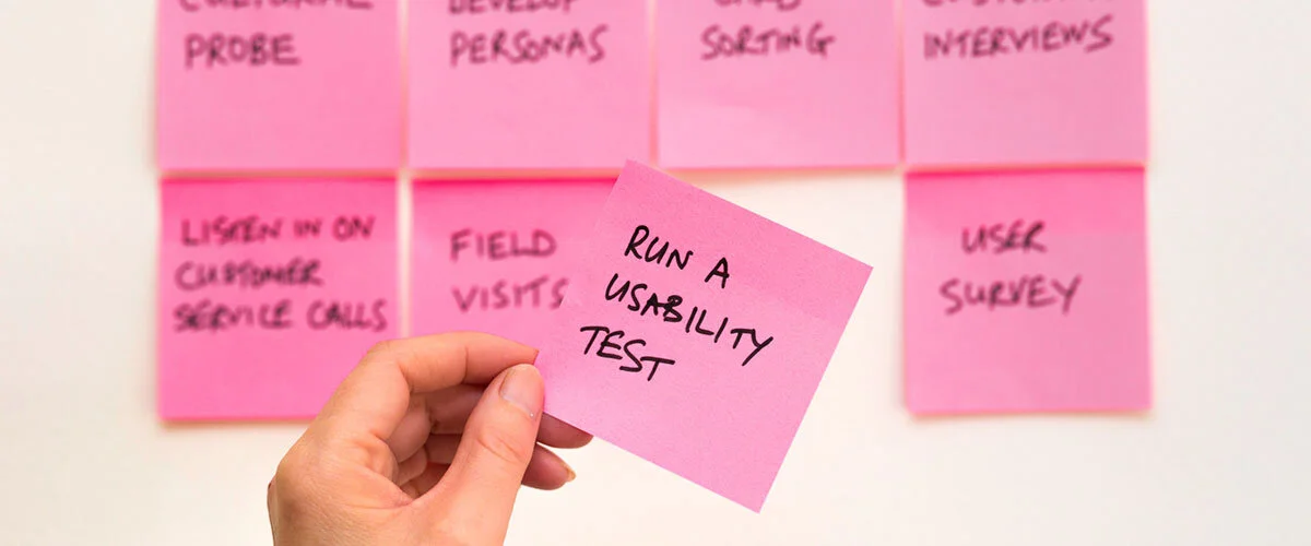
The purpose of the first two rounds of user testing is to observe the realistic user experience with real prospect users, get feedback, and improve the design through testing and iterate. The users’ size for these testings was around 20, including people with disabilities, program grantees, organizations, staff, and professionals.
To understand what truly work well, we had to validate the UX and get feedback from real users.
At the beginning of the project, we validated our ideas through the market and competitive analysis, interviews, scenario writing, and user personas. We now need user testing to validate UX and design as the platform’s first prototype is completed. To start, I helped to draft the User testing survey questionnaires. At the same time, another core team member created the survey, collected the results and feedback. We also held and organized testing orientations.
Before the 3rd round, the committee and board members’ user testing, we had fine-tuned the product UX and design based on the feedback and analysis reports from the first two rounds of user testings.

Built for Growth
Before the user testing for the committee members, we ran into the situation that we will need a quick, flexible yet economical way to update sections regularly. However, we were running out of budget and time to have the developers building out additional features.
As a result, I dived into researching some third-party tools that will work for us. After a series of research, testing, and exploring, I identified Cincopa, an award-winning platform that provides marketing, communications media, and video hosting solutions. With their powerful support on media accessibility like screen reader readiness, auto/ manual captions, custom code implementations, and plenty of analytics reporting options – not only that it fits our needs, it is also a great tool to help the platform reach its potential. I was able to custom code for a series of featured slideshows on main landing pages.

Marketing Analytics & Reporting, SEO, Social Media and CRM Readiness
In the digital age today, those are great arsenals to pave the road to success for any digital platform. Hence, the capabilities of marketing analytics, reporting, SEO, Social Media, and CRM readiness are built in from the start.

Art Direction
I spent lots of time exploring the template collections to identify the one that fits our site style and accessibility compliance. For example, the video/ photos displayer can’t do autoplay, and it’ll need the captions/ paragraph display at the right contrast ratio, etc. After picking the right-out-of-the-box design, I modified the design through custom CSS/ HTML code to merge the multimedia player seamlessly into the site.
Here is an example of my custom code for all the headline section of the landing pages. They are created in flex containers and each of them has a custom icon to add a visual touch to the heading.
A picture is more than a thousand words
The visual theme and expression are how others can relate to us, instantly and intuitively. For this, I have chosen a mission-driven brand identity that presents the resilience of the disabled community and the ways for disabled people and their loved ones to live a quality life.

Impact

Despite that we went through a series of resources and technical challenges, especially the on-boarding and off-boarding of project managers and developers, plus the transition hiccups during the early development phases, we chose to communicate with our design partner honestly and understanding.
Working on the solutions together and not putting blames on what caused the problems, is the secret ingredient that drove the platform’s completion and ready for three rounds of user testing.


